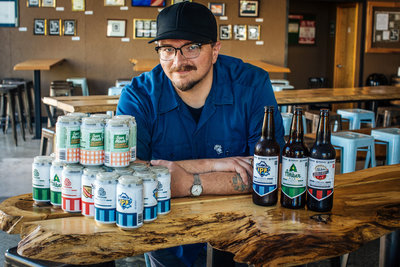
In his office at Oakshire Brewing, Eric Keskeys flips through a weathered paperback revealing hundreds of ancient shapes and patterns. The room is dark, save for the glow from his dual computer screens, where working templates of beer labels have been put on pause.
He stops on a page to point out some trefoils in what he calls a design bible — the Handbook of Designs and Devices: 1836 Basic Designs and Their Variations, originally printed in 1946.
“We started with a couple options and discovered these exist in this book,” says Keskeys, Oakshire’s sole in-house graphic designer. He’s talking about the logo Oakshire debuted earlier this year — a grey and white trefoil of a stylized oak — or what he describes as a modern interpretation of the brewery’s original swirling oak logo.
“It served us really well as we were starting up,” he says of the original. “We’re moving into this new direction.”
Oakshire is not the only local brewery moving in a new direction with branding; Ninkasi is in the thick of a design evolution as well. The timing is no coincidence: Both breweries were founded in 2006 and are marking their 10th anniversary year by rolling out more sophisticated aesthetics and more refined brand narratives on labels and packaging.
The shift is part of a larger trend in the beer industry. The golden age of craft brewing has ushered in a golden age of beer branding. As the craft beer movement grows, so does competition, and survival can mean a product catching the eye of a consumer when there are potentially hundreds of similar options on the shelf.
Oakshire and Ninkasi have a leg up in the fight for the customer’s eye because of a rarity among breweries: in-house art and design.
 |
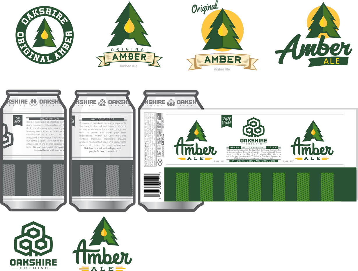 |
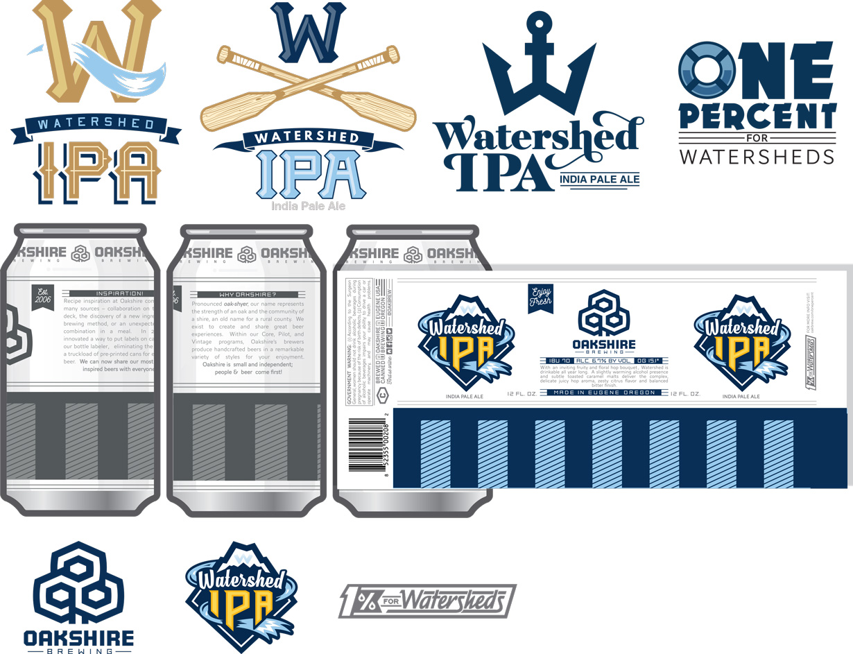
| Process images from Oakshire’s can redesign |
A New Shire
Keskeys says he and Jeff Althouse, Oakshire’s founding brewer and owner, sat down last year at one of the picnic tables outside the brewery’s public house to hash out a new direction.
“We were trying to figure out: What are our brand programs?” Keskeys recalls. “We were able to whittle everything down.”
Althouse and Keskeys came up with three brand programs that Oakshire brews fall into: core (flagship beers and some seasonals), pilot (experimental) and vintage (aged or high ABV styles).
“All those programs work together,” Keskeys says. “Those three shapes live inside the logo.”
He also added a striped pattern to the lower portion of can and bottle labels to act as a sort of second, textless logo.
“These stripes on all these cans, when they’re billboarded on a shelf, they’re just going to read: This is our logo,” Keskeys says.
The refined logos were just the beginning, however, as Keskeys also has been working on re-branding labels and packaging of each individual beer, from the stalwarts like the Watershed IPA and Amber Ale to the highly seasonal sour Sun Made Cucumber Berliner Weisse to brand-new brews that have yet to hit the shelves, such as a Baltic porter.
“Outdoor recreation is a big part of our identity,” Keskeys explains, but “let’s maybe make it so it’s not the typical crest with mountains and streams” in the design.
While the Watershed IPA label does feature a mountain and a stream (it is the watershed, after all), the labels for Overcast Espresso Stout, Reclamation Lager and others are like short stories. The lager, for one, features a handsaw and a wood-grain crest.
The new look is sharp, bright and iconic with a tinge of retro — a departure from the neutral-toned uniform labels of yore. The designer says his inspiration is rooted in the late ’70s, when President Jimmy Carter signed a law legalizing homebrewing of beer with higher than 0.5 percent alcohol content, and a “weird little renaissance” in craft brewing took off.
“I kind of asked myself the question: If I was working in a props department and making beer for a movie in like ’78,” Keskeys says, “how would I make that beer look?”
The new design templates paired with Oakshire’s new labeling process allows for unprecedented flexibility in everything from a beer’s seasonal identity to the size of the batch and the timing of its release. Oakshire recently discovered that its bottle labeler also works for cans.
“We can decide on a beer two months ahead of time,” Keskeys says, pointing out that most new beers have typically had to be planned a year in advance. “We can wrap them and move really light and quick.”
Regardless of increased efficiency and flexibility, Keskeys is a one-man art department and says he looks forward to 2017, when the majority of new branding will be in place.
“Next year is going to be a lot easier,” he says with a laugh.
 |
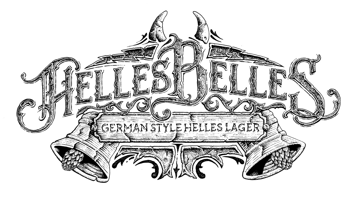 |
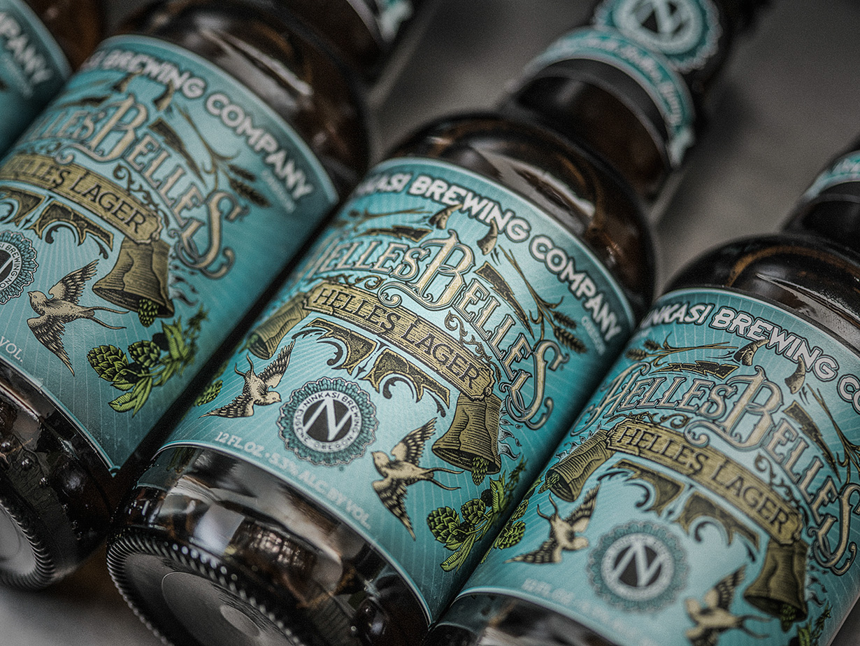 |
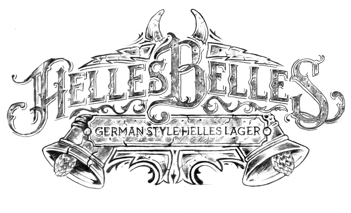
| From sketch to label of ninkasi’s new helles Belles design |
The Ninkasi Narrative
In its art department, Ninkasi now employs creative director Nicholas Yarger, graphic designer Wade Long and artist-in-residence Neal Williams. This is unheard of for a brewery that’s below, say, Sierra Nevada’s prominence.
“It’s always been one of our strengths to have an in-house art department,” says Jamie Floyd, Ninkasi co-founder and founding brewer. “Most breweries shop this stuff out. For us, it means we get to tell our story in the most genuine way we can.”
“It’s increasingly hard to come up with creative names [for beers] with so many breweries coming up with so many ideas,” he continues. “People need to look for a more creative way to get a voice out.”
More than getting the voice out, the well-oiled art and branding machine that is Yarger, Long and Williams must dial in the soul of Ninkasi, as they put it. Long says this is possible because the art team is part of the company, interacting with senior management and brewers on a regular basis.
“Where people fall short is where they have to go out for their art and you’re getting an interpretation from a third party,” Long says. “They’re not entrenched in the culture of the company.”
“We’re putting personality, we’re putting soul into our labels,” Yarger adds. “I think that’s what really separates us from what a lot of other brands are doing right now.”
Long has been at Ninkasi for four years, while Yarger and Williams both began in the brewery’s art department in June 2015. When Yarger came on as creative director, he says his goal was to rebrand Ninkasi’s entire lineup, taking the original branding from former Ninkasi creative director Tony Figoli and pushing it a step further.
Standing in Ninkasi’s bright industrial art department in the administration building in the Whiteaker, Yarger points to a corkboard stretching across one wall. Pinned to it are dozens of marketing materials, including some of the original designs for Oatis Oatmeal Stout, Spring Reign American Pale Ale and Maiden the Shade.
“The art director before me did a good job of branding all of our flagships,” Yarger says. “It had a very distinct look. I’ve kind of just adopted that and just added to it — added more personality, added a little more texture.”
Looking at the redesigns on the corkboard, it’s clear Ninkasi has embraced a more narrative, detailed approach, which has been influenced by Williams, a gig poster illustrator by trade. Now, The Total Domination IPA label features sunny snowcapped peaks, Dawn of the Red IPA has a detailed sign of the horns against a field of red zombies and Tricerahops Double IPA features a teal triceratops.
The design du jour, however, is for Ninkasi’s limited run of the commemorative 22-ounce N10 Imperial Blended Ale to celebrate the brewery’s 10th anniversary, to be released in July. For this project, the art team did decide to collaborate with an outside artist, the Portland-based designer Blaine Fontana.
“We love to support the art industry too, and working with another artist always brings new stuff to our work,” Long says.
The packaging is a trip. The box is wrapped in a holographic foil, as is the bottle label. The colors are bold oranges, yellows and reds marked by teal icons of beer barrels, the brewery, foam “No. 1” fingers and more. Long says he had been unsure if senior management would support the costly holographic foil, but they embraced it immediately.
“To have that trust from them to be creative and really let us do what we’re good at is something really special,” Yarger says. “Doing [design] for 20 years, it’s very rare that you have a senior management team who’s like ‘Yeah, you guys, we trust you. Kill it.’”