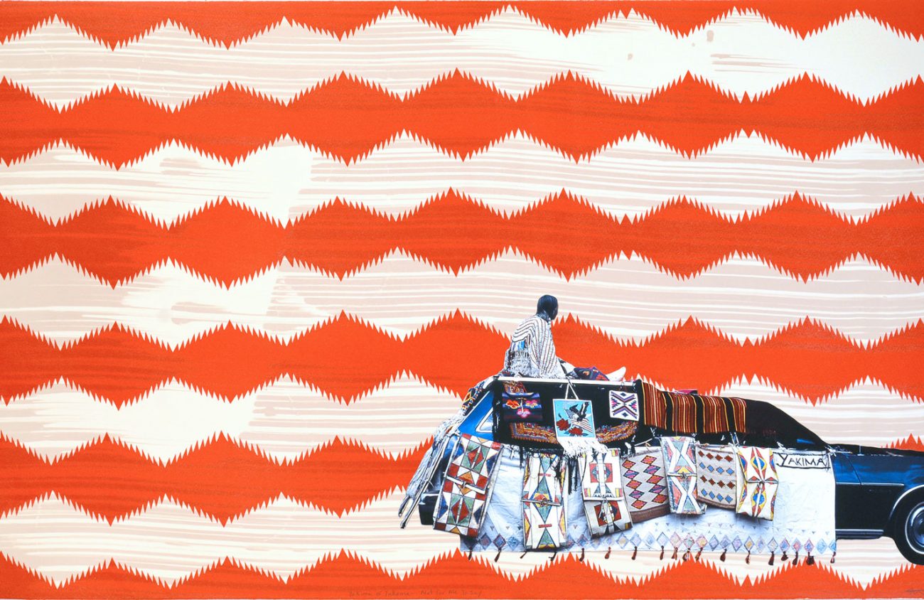
If you like art that keeps you looking, that brings you back for a second or third glance, then you will appreciate the art of Wendy Red Star, a Portland photographer and multimedia artist who was raised on the Apsáalooke reservation in Montana. An exhibit of her work is open at the state Capitol in Salem through May 11.
There’s a sense of discovery to be found in Red Star’s work that might take you by surprise because, at first glance, her art seems simple, even childlike. Her subjects are recognizable objects from everyday life: a car, a truck, a house. They seem to have been cut out of photographs and then placed on backgrounds drawn in with colored lines and easy-to-read designs like diamond shapes and stars.
Red Star’s photograph The (HUD) is a picture of houses. Simple, right? It would be if the houses were depicted the way we would find them in life, attached to the ground. But they are situated vertically, reorganized one on top of the other. One person’s roof winds up another person’s ground, and so on and so forth to the top of the page. They are melded together so seamlessly you might not notice that the colorful tower you first see is impossible.
To complete the illusion, the houses get smaller the closer they are to the top, creating the effect that we’re getting the perspective of looking up at a diminishing structure.
Where is this impossible tower? There is no background other than a smear of pigment running down the length of the page. It acts as a connective visual element and also reads like a tornado swirling in the not so far-off distance.
There have been scientific studies done on how the mind fills in what it cannot see. You can play with this idea yourself by drawing a line horizontally across a page. The line reads as a horizon line. The mind fills in the sky and earth.
That’s what Red Star counts on when she places her cut-out of a car on top of hand-drawn lines. In the artwork enit the lines in the background read as the horizon line, roads and the ground upon which the car sits. Vertically the bands of color move from blue at the top to orange at the bottom, taking on an appearance of the vault of the sky at sunset (or the colorful design of a tapestry — your choice).
The subjects of these works have been cut out of their original contexts. All we have to go by are patterns drawn in the background. Yakima or Yakama — Not For Me To Say, a work from 2015, echoes the layout of enit from 2010. In both a vehicle has been cut out of its original context and placed at the bottom right of the page.
At first glance you may think the vehicles in these artworks are moving, but at closer inspection it is apparent they are at rest. People aren’t driving these cars or trucks; they are reclining in or on them. Their faces turned from the viewer, they look at where they are.
They, like us, look at the lines drawn by the artist.
Another hint that the vehicles in these artworks are not moving is that they have blankets, tapestries or artwork hung on them. Maybe they were cut out of photographs taken at a ceremonial gathering?
One thing for sure about this exhibit is the appropriateness of its locale. The show is sponsored by the Office of the Governor and the Oregon Arts Commission. According to the commission, Red Star’s art explores “the intersections of Native American ideologies and colonialist structures …”
It is entirely fitting, then, that Red Star’s artwork is on view in the Capitol, particularly at the Office of the Governor where it hangs in the reception area, a space reserved for welcoming visitors to ceremonies of the state. There it waits ready to intersect, colorful and fun.
Can it appear almost childlike at first glance? Yes. But the way it cuts out and reorganizes and draws in and restructures adds up to something serious.
