Like a lot of other people, I often scout the shore while walking on the beach looking for just the right shell to take home, something whole and nice to look at, to remind me of the day. A beer label is like a shell in that it’s a remnant, something to remind you of what once was.
Nick Yarger, creative director at Eugene’s Ninkasi Brewery, similarly describes collecting labels in terms of nostalgia. They can take people back “to a certain place or time,” he says. “It reminds them of something they had when they were younger or of a great time in their life.”
Labels remind you of the beer you had and also of the day you had it. They act as souvenirs, taking you back to the place you were and perhaps the people you were with. And maybe even further to memories associated with ingredients in the beer; tastes that aren’t often singled out any other way except through memory.
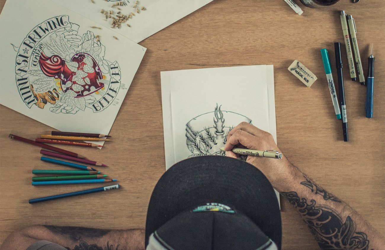
Yarger also collects, but not just the labels. “I collect the cans,” he says. He likes the metal surface as a medium. Illustrations are normally found on flat surfaces, on paper, so he finds viewing them on round, metal cans appealing.
He’s been creative director at Ninkasi for around three years and guesses he has worked on about 25 to 30 beer label designs. O
ne of his favorites is the label he created for Pacific Rain, a year-round flagship beer. The label features a graphic, triangular design that points to the location of local ingredients and type of beer: “Northwest Pale.” If you tried this beer at the brewery tasting room and collected the label, you’d have no doubt as to where in the world you were when you had your first taste.
Yarger likes this label because of the simplicity of the design and how well it works to convey the message. It’s “spot on,” he says.
Graphic and logo design often aspire to simplicity. Think of Nike’s swoosh or Target’s target. When it was time to come up with a label for Ground Control though, a complex imperial stout that includes Oregon hazelnuts in its brew, the company went a different way, seeking out Eugene gig poster artist Neal Williams.
Ali AAsum is communications director and has been with the brewery for five years, long enough to have been present for the launching of Ground Control. She says that behind every label is a story.
The story behind Ground Control is a doozy. Before the beer was launched as a brand it was launched — into space. AAsum attended both times the brewer’s yeast was rocketed into space. The first time it was launched, by Civilian Space eXploration Team and Team Hybriddyne, the yeast was carried to space but then lost in the Nevada desert for nearly a month, rendering it unusable. A second launch was executed by UP Aerospace Inc. and the rocket safely brought back six vials of yeast.
Cofounder of Ninkasi Jamie Floyd speaks about the trip to outer space in terms of metaphor: “This is all about exploring the future of brewery.”
Ground Control is part of Ninkasi’s limited Goddess Collection series. Drinking this beer gives you a taste of space. That’s pretty cool.
Enlarge

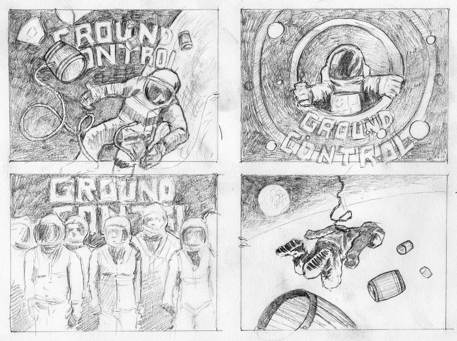
To match this cool factor Ninkasi approached Williams, who has illustrated posters for musicians such as Queens of the Stone Age, the Dave Matthews Band, and Interpol. Williams was Ninkasi’s first artist-in-residence, and the illustrations he made for Ground Control feature detailed line drawings of a rocket blasting off behind a Ninkasi astronaut hovering in space.
A Ninkasi artist residency is not the typical one you might find at a museum or arts center. There’s no time frame, and it’s not project- or mission-statement-driven. Williams came in twice a week for years. The current artist-in-residence is Rob Sydor. Ninkasi’s in-house art department relies on him heavily for photography.
Will Sydor’s residency last the same amount of time as Williams’ did? Yarger doesn’t know. It will last as long as it’s beneficial for both parties, he says.
I asked Yarger, who has a bachelor of fine arts degree, how he felt about the distinction some people make between fine art and illustration and design.
“At a very high level,” he says, “they’re the same, trying to communicate an idea.”
Anyone who has been to Eugene’s Bier Stein likely has been impressed by its refrigerated wall of beers. The place boasts over 1,000 bottles of beer. When I walk along that wall I am drawn to the creativity and playfulness of labels.
They often have literary, geographical or historical references, and I’ve noticed since moving here that certain Oregon breweries, such as McMenamins, Rogue and Ninkasi, go all-out. McMenamin’s renderings extend beyond labels to illustrations on walls of pubs and hotels; Rogue’s message goes out to Rouge Nation; Ninkasi’s NSP — Ninkasi Space Program — reaches to outer space.
Yarger feels that this connection between creativity and beer, and the appreciation that brewers have for art, is due to a passion for craft in general.
“It’s the craft aspect of it,” he says.
My appreciation of labels relates back to how I first started appreciating art — not in an art appreciation class, or in a museum seeing a van Gogh or da Vinci painting. My love affair with art began with illustrations in children’s books. The illustrations on beer labels, particularly present in Neal Williams’ work — realistic yet fanciful — remind me of those first stories.


